Pepsico iconography
Design Brief :
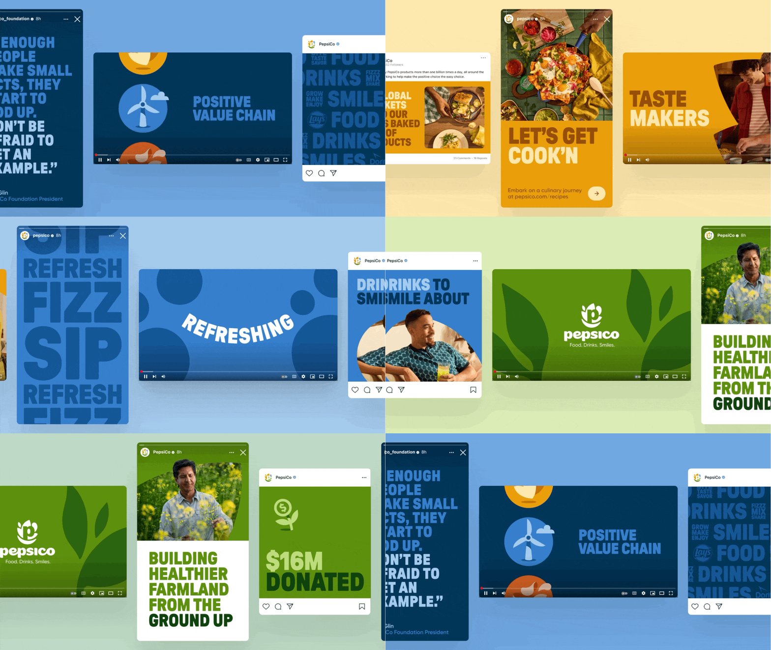
Building on our logo and truly modular design, we're developing a flexible system that works across multiple platforms
enabling a variety of messages to be communicated in a unified and consistent way.My Role : Style Exploration / Graphic design
Generate design styles
Establish art direction
cross-functional collaboration
Graphic collaboration with animation team
PepsiCo Design Team
Head of Design
Director
Senior Manager
Cross-functional Teams
Patswerk (Animation)
Studio Mega
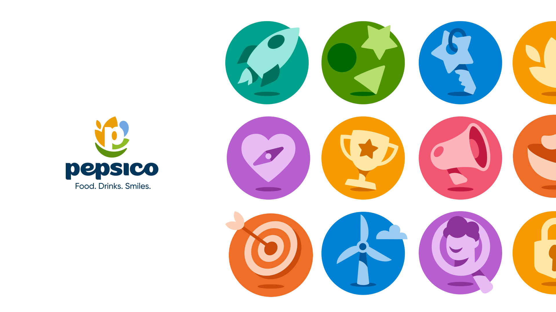
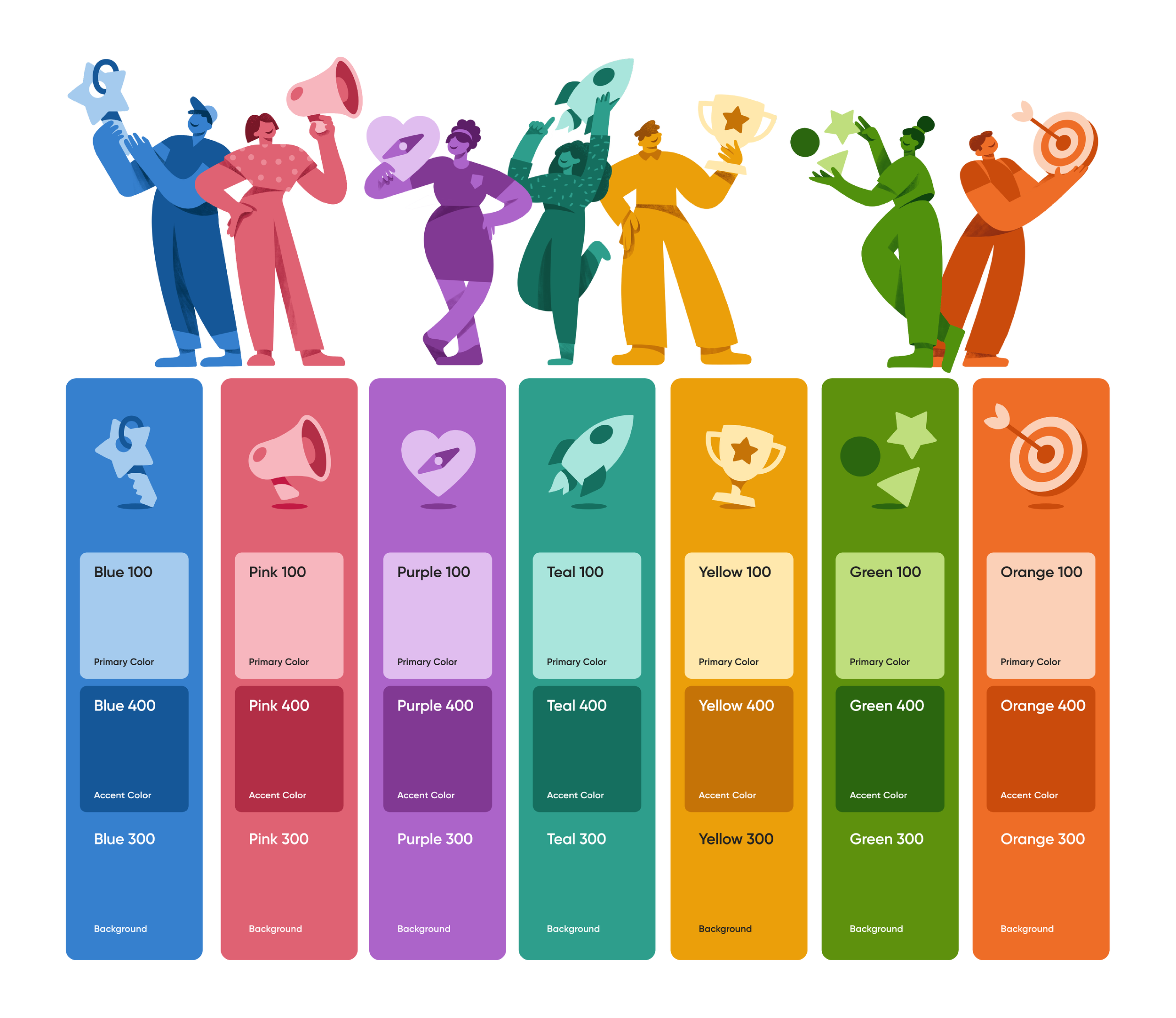
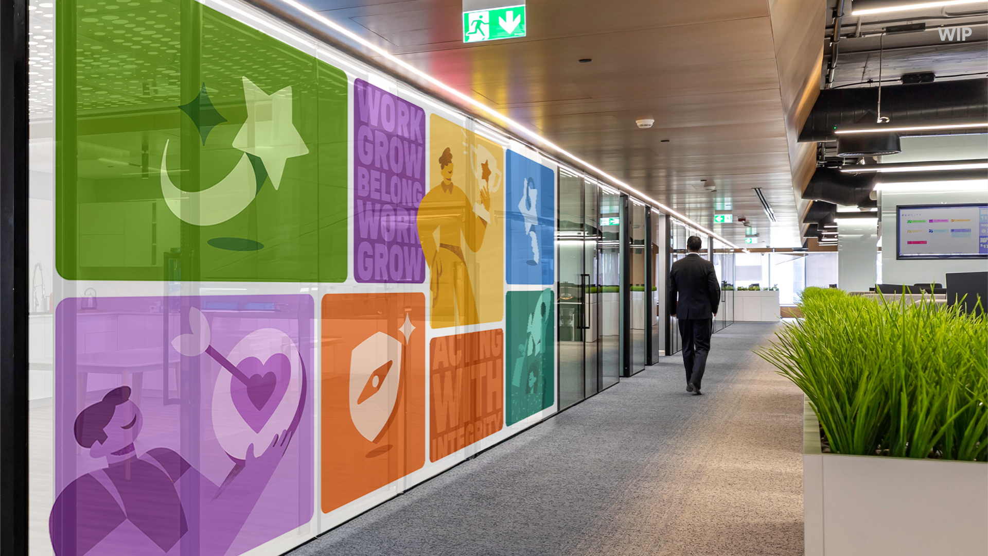
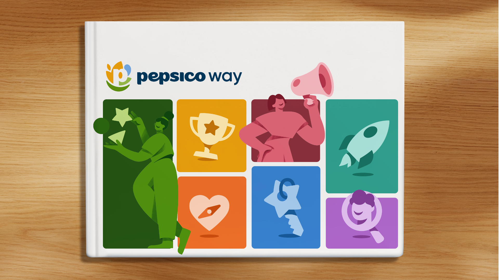
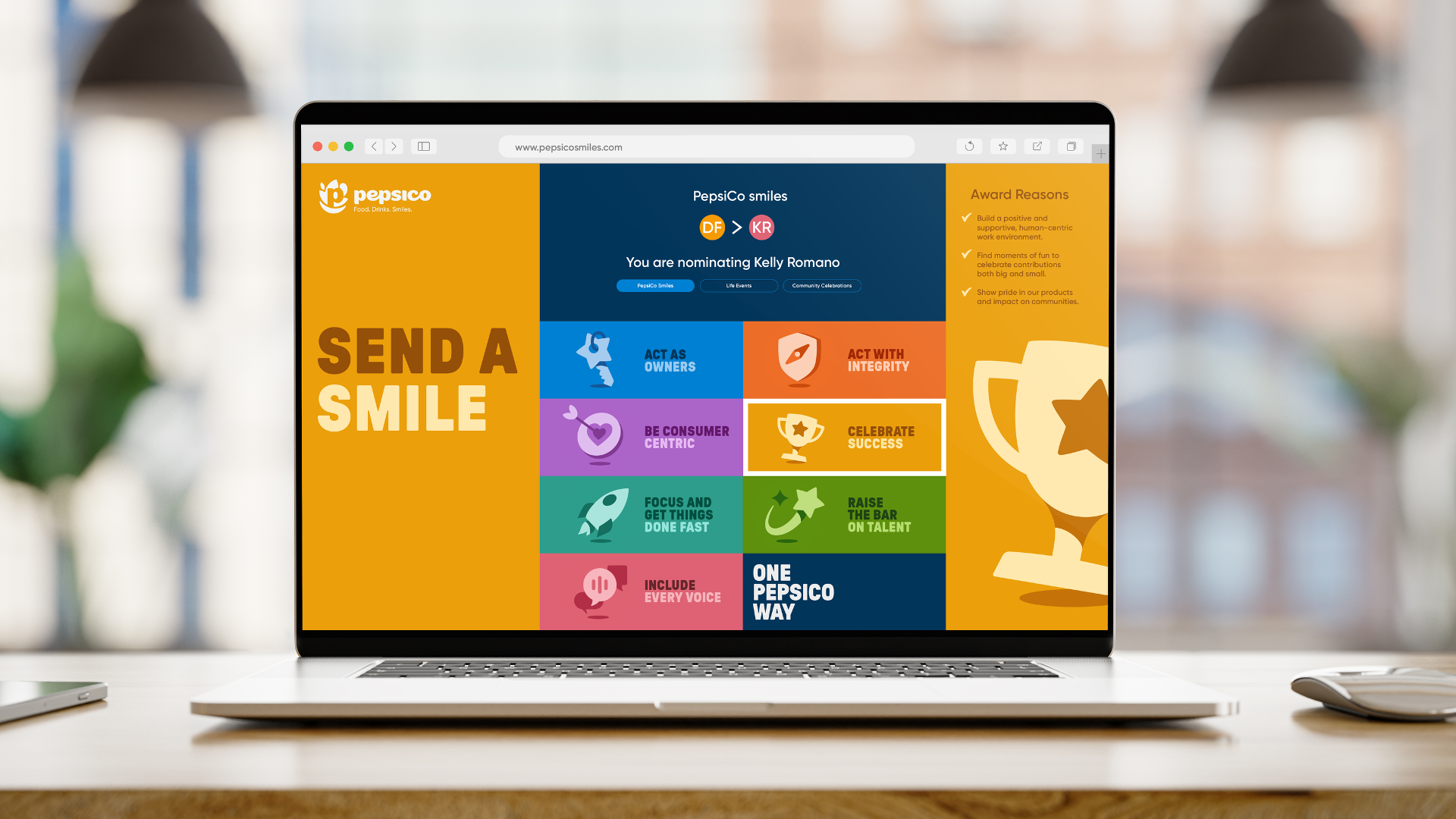
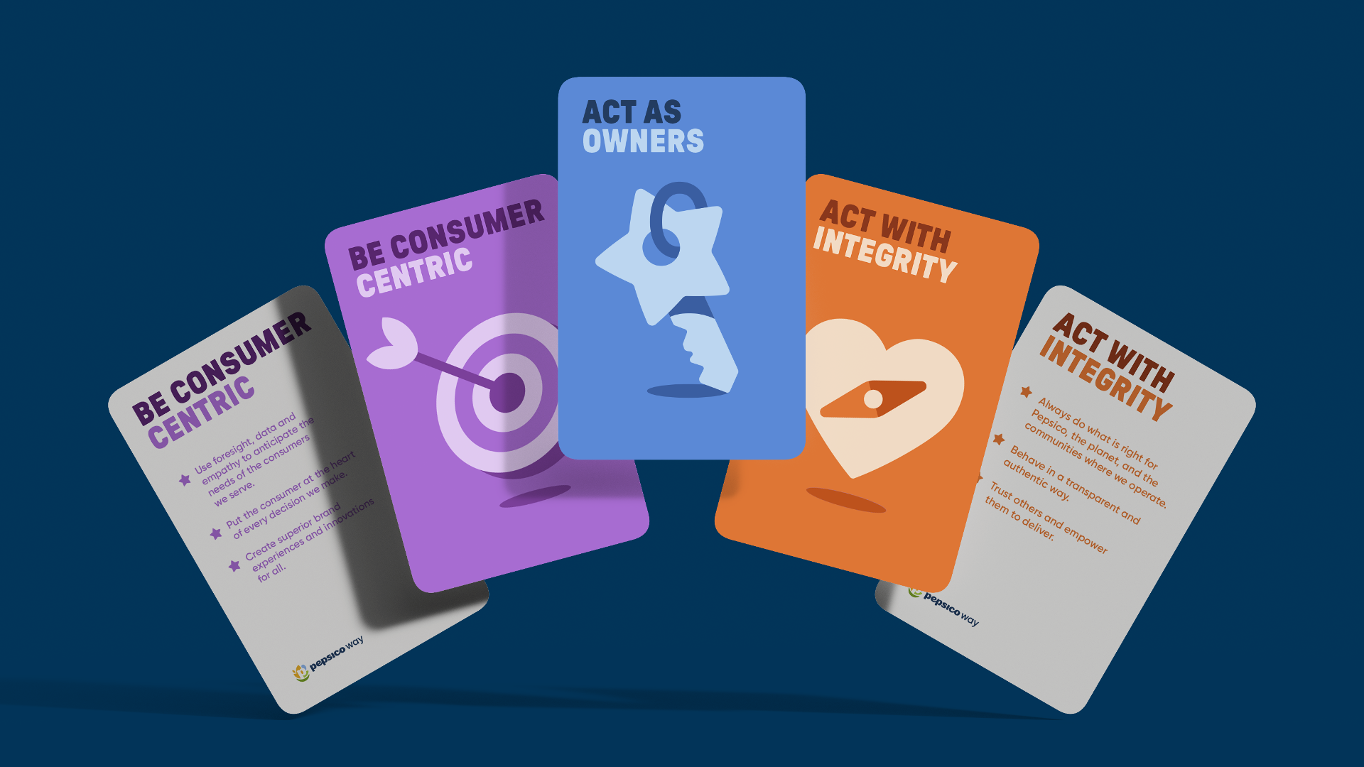
Style 1 / Monochromatic Three-tone
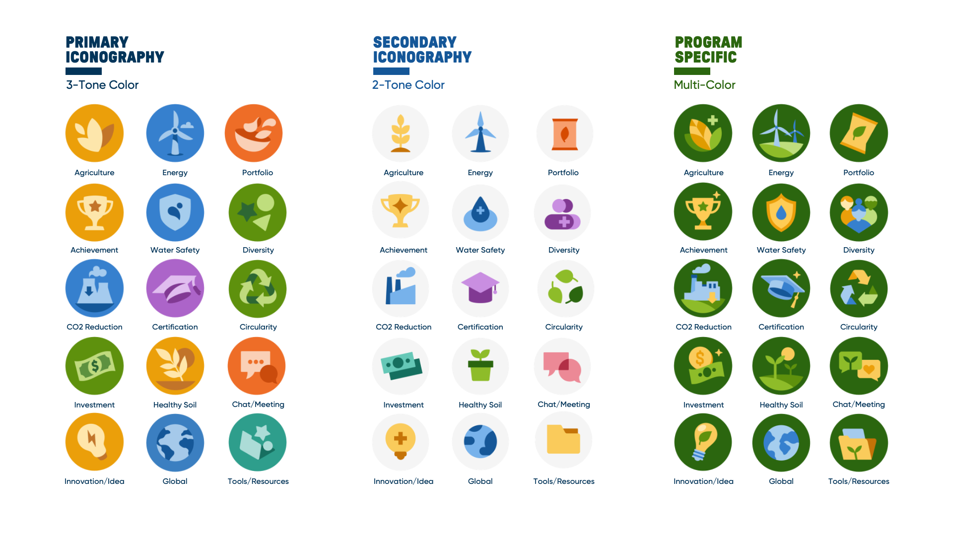
Inspired by our logo, this style:
•Aligns closely with PepsiCo logo visual style
•Simple color alternations
•The most ownable
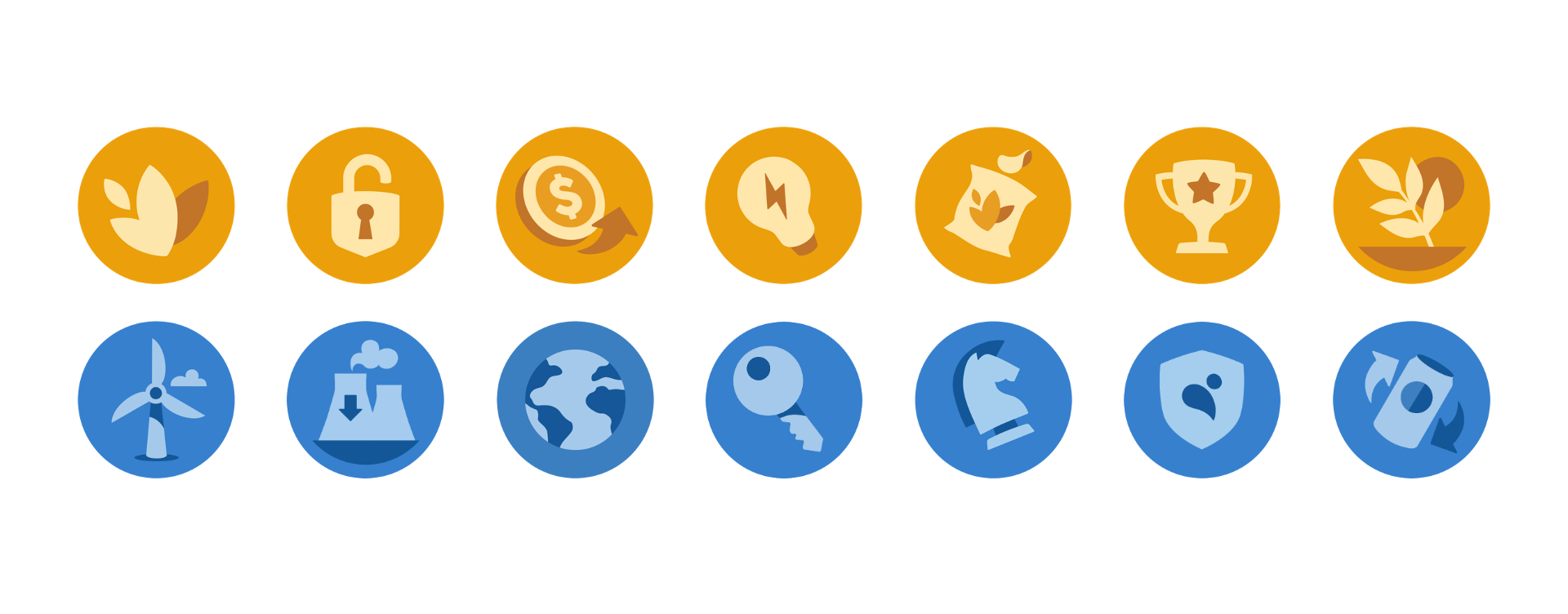
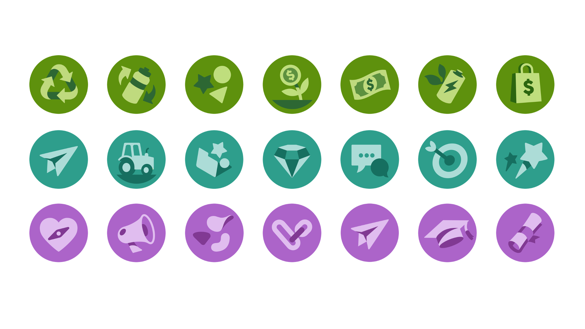

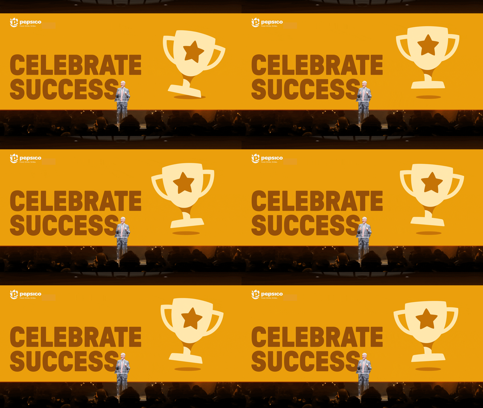
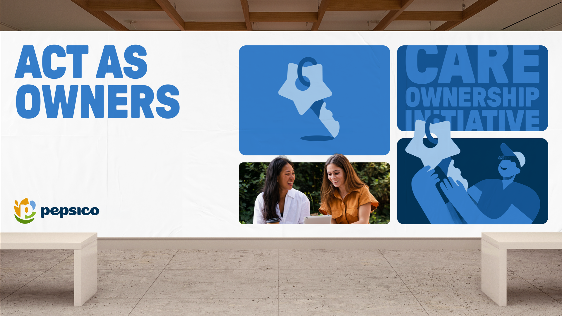
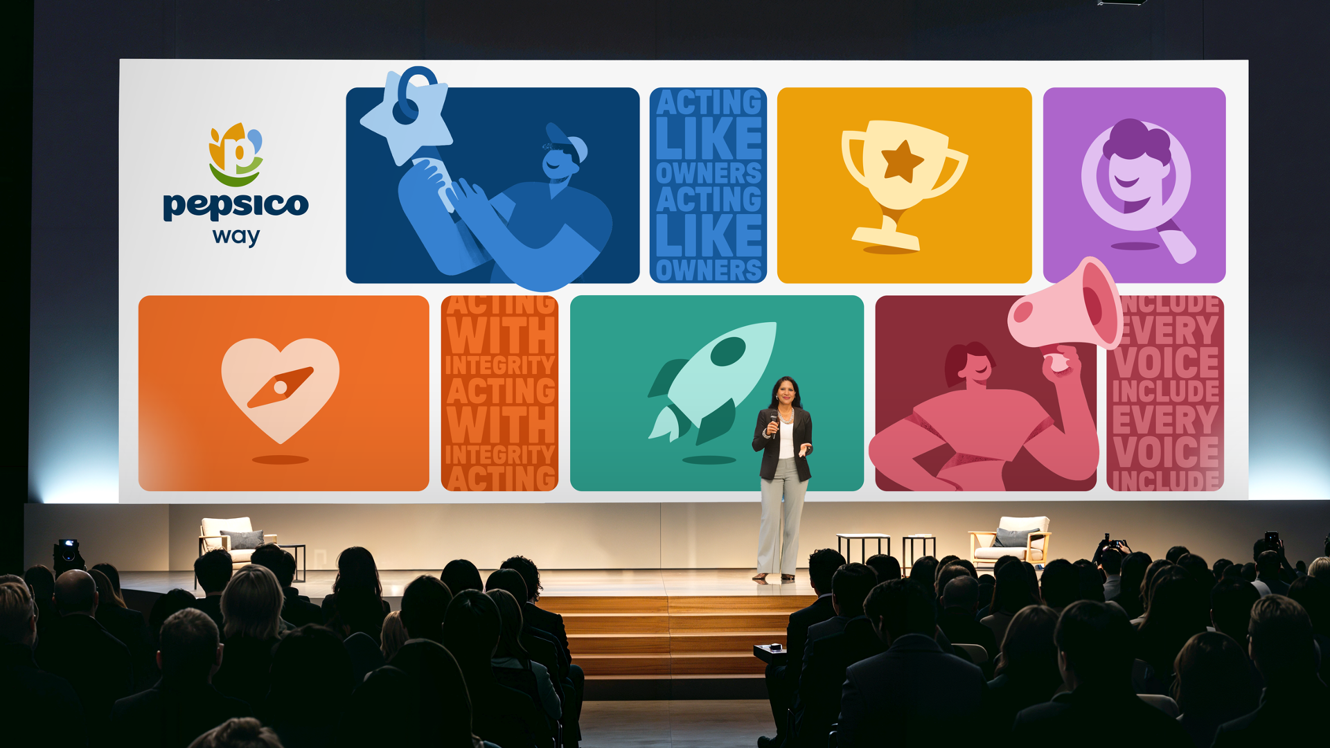
Style 1 / Monochromatic Three-tone
can be applied to events, each icon are treated as an illustration.
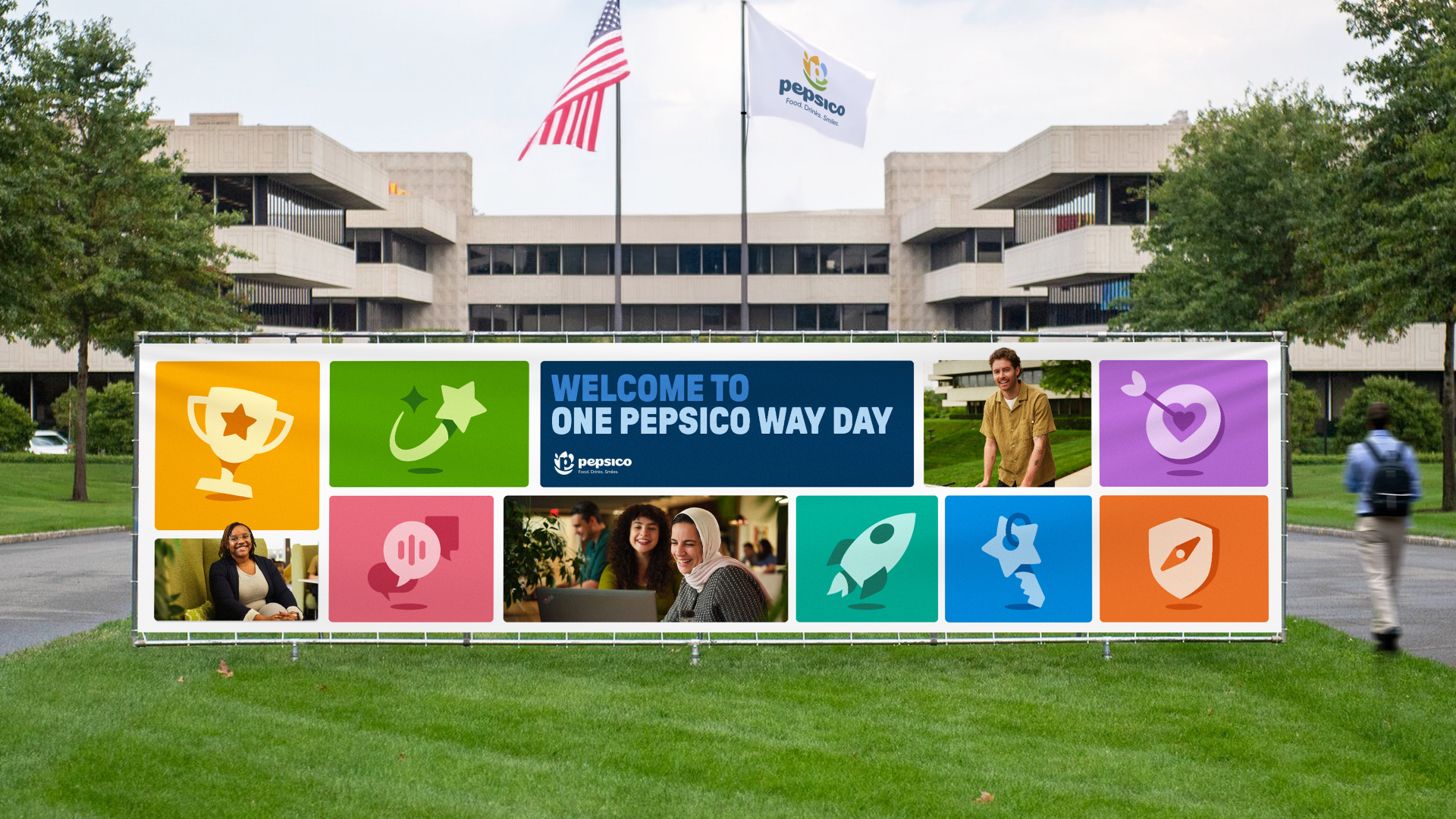
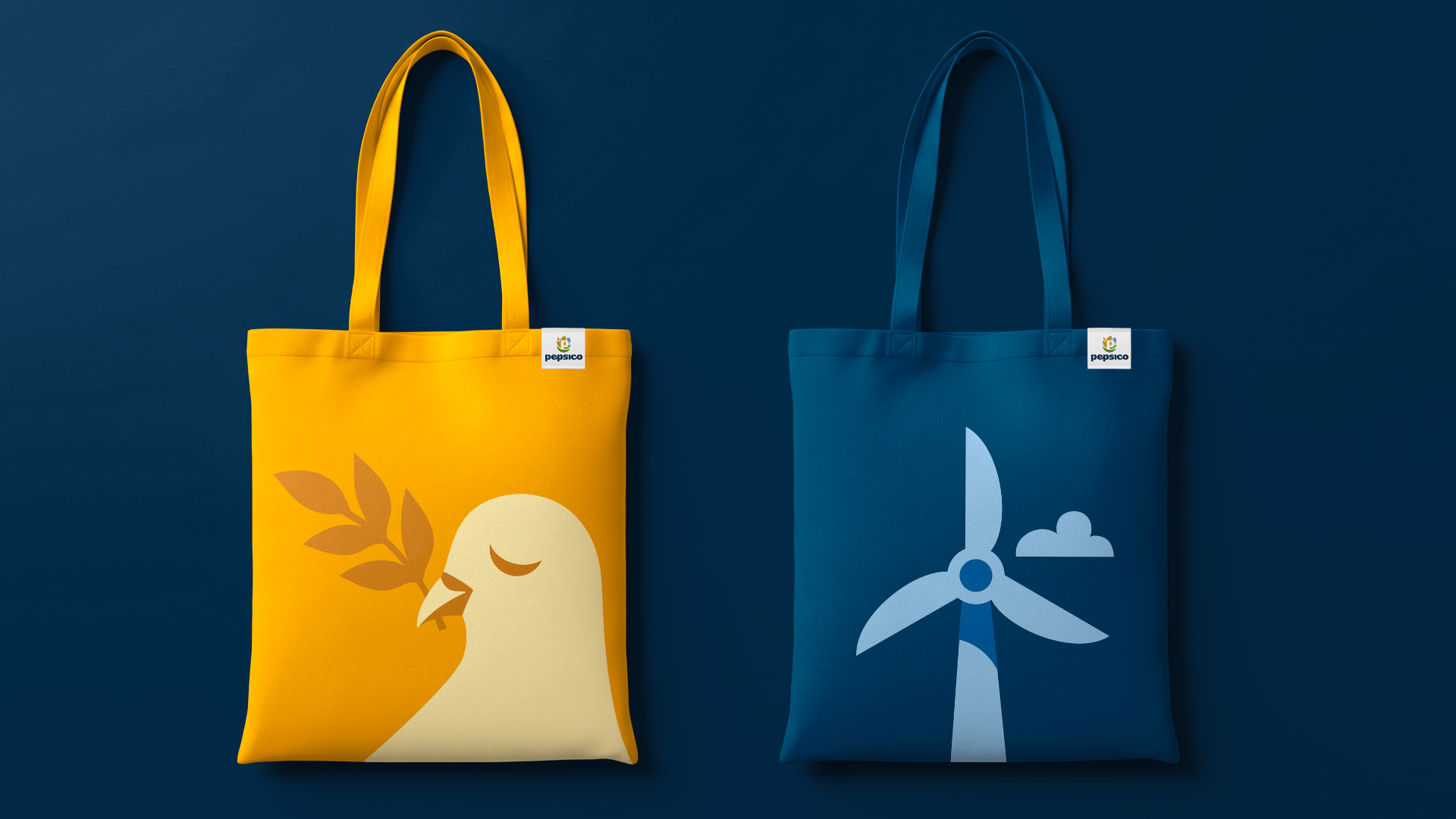

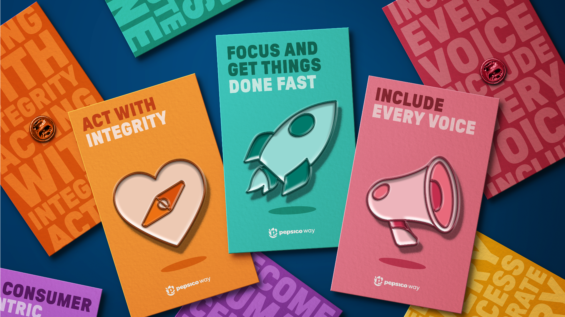
Style 1 / Animated icons <elaborate> quirky friendly














Style 1 / Animated icons are translated into characters each representing different diversity of people.
Future contributors must following a specific color guidance.
Style 2 / Two-tone Iconography
•Simple and easy to manage
•Easy of producing new one with consistency, follows a grid.
•Performs well across different backgrounds, including Universal Blue and white.
•Versatility. Can turn into one color if needed.

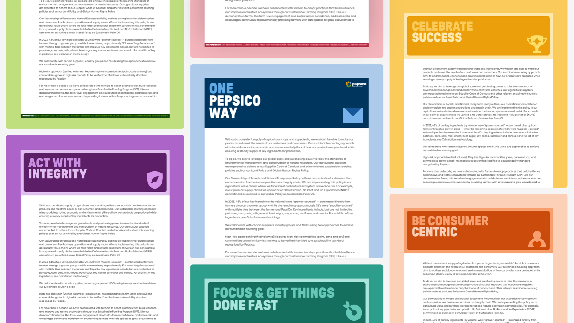
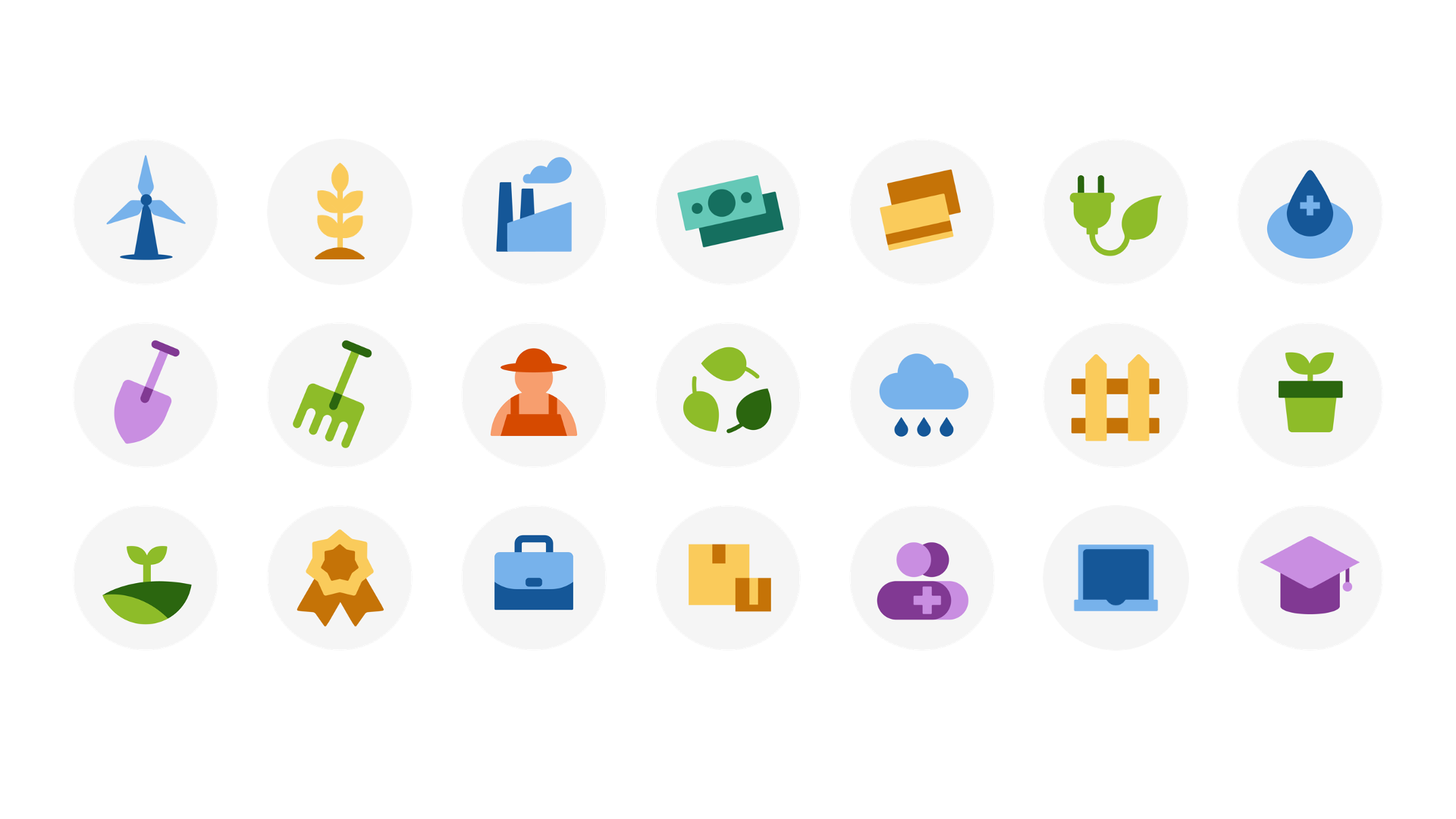
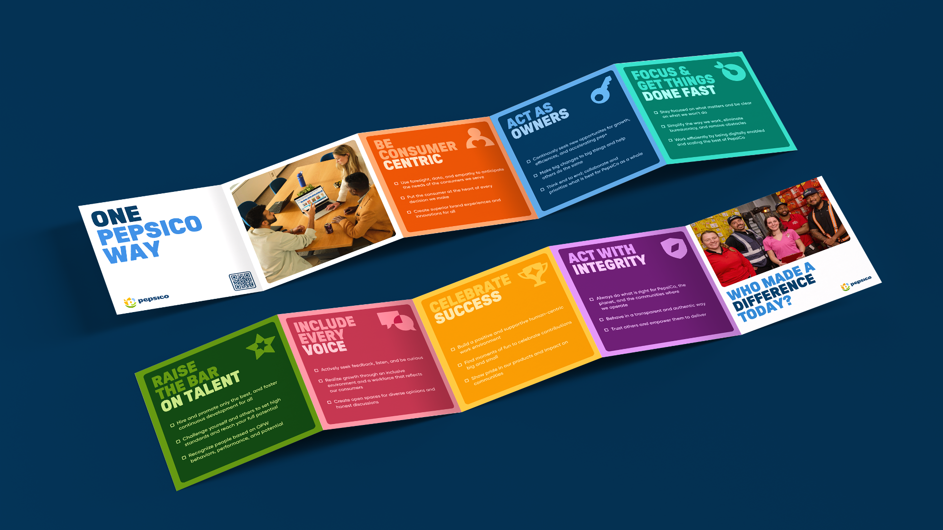
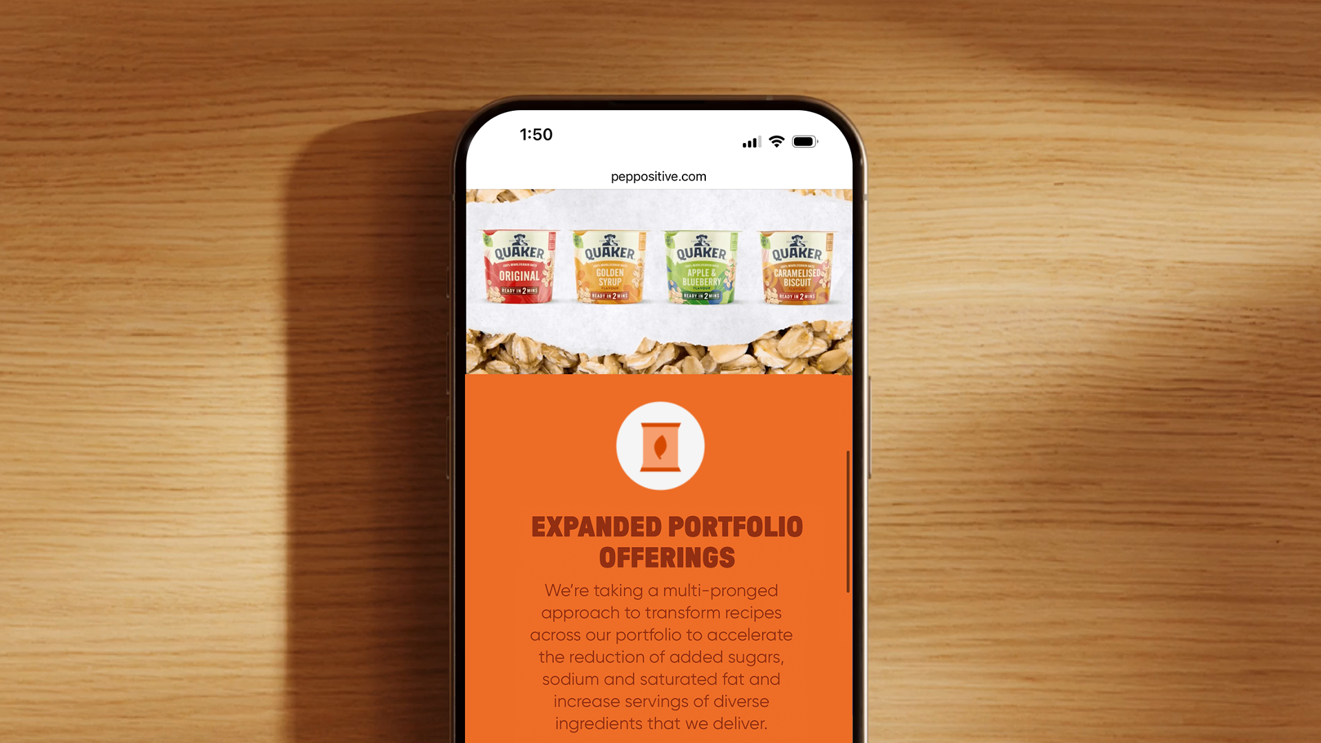
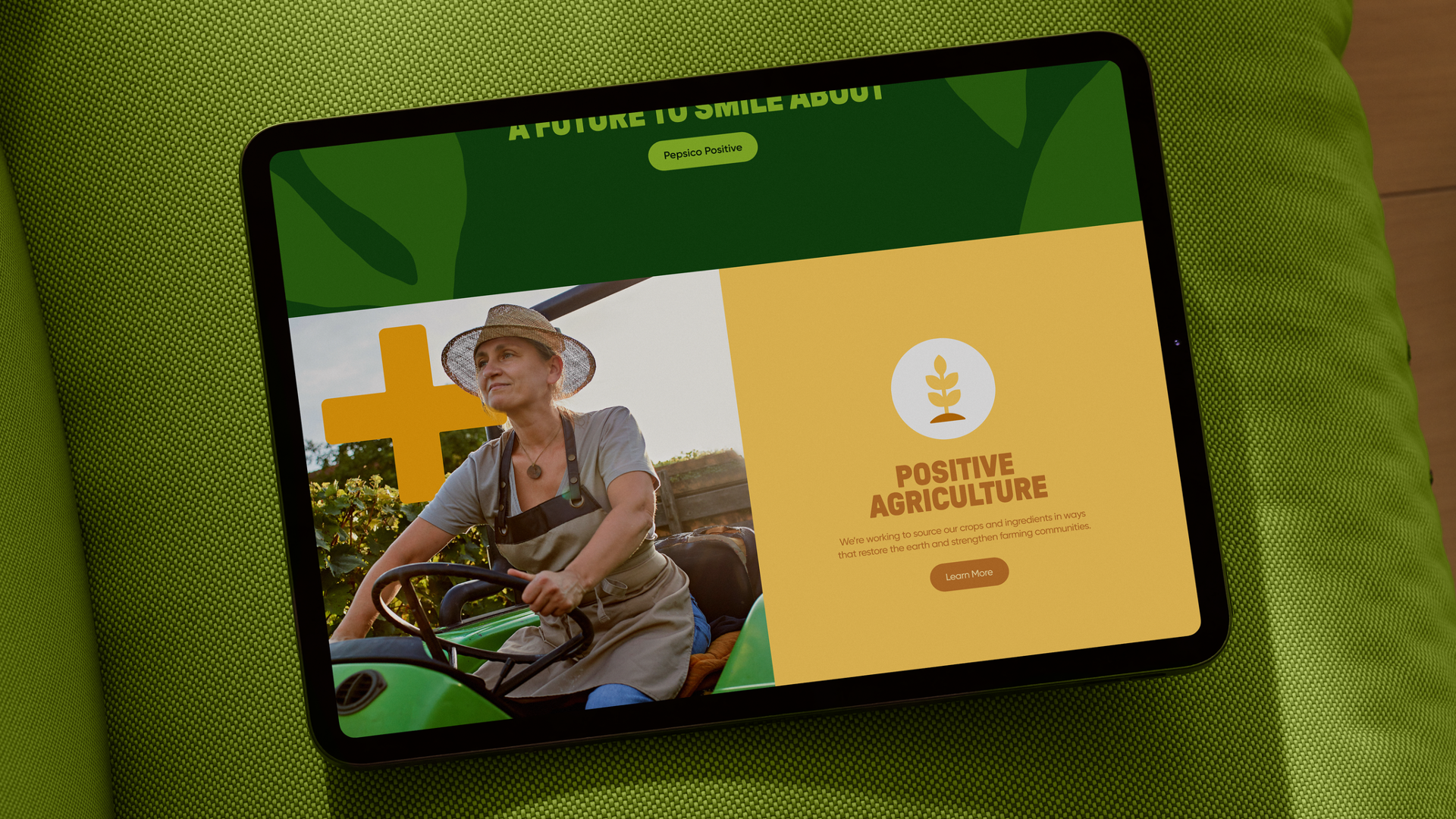
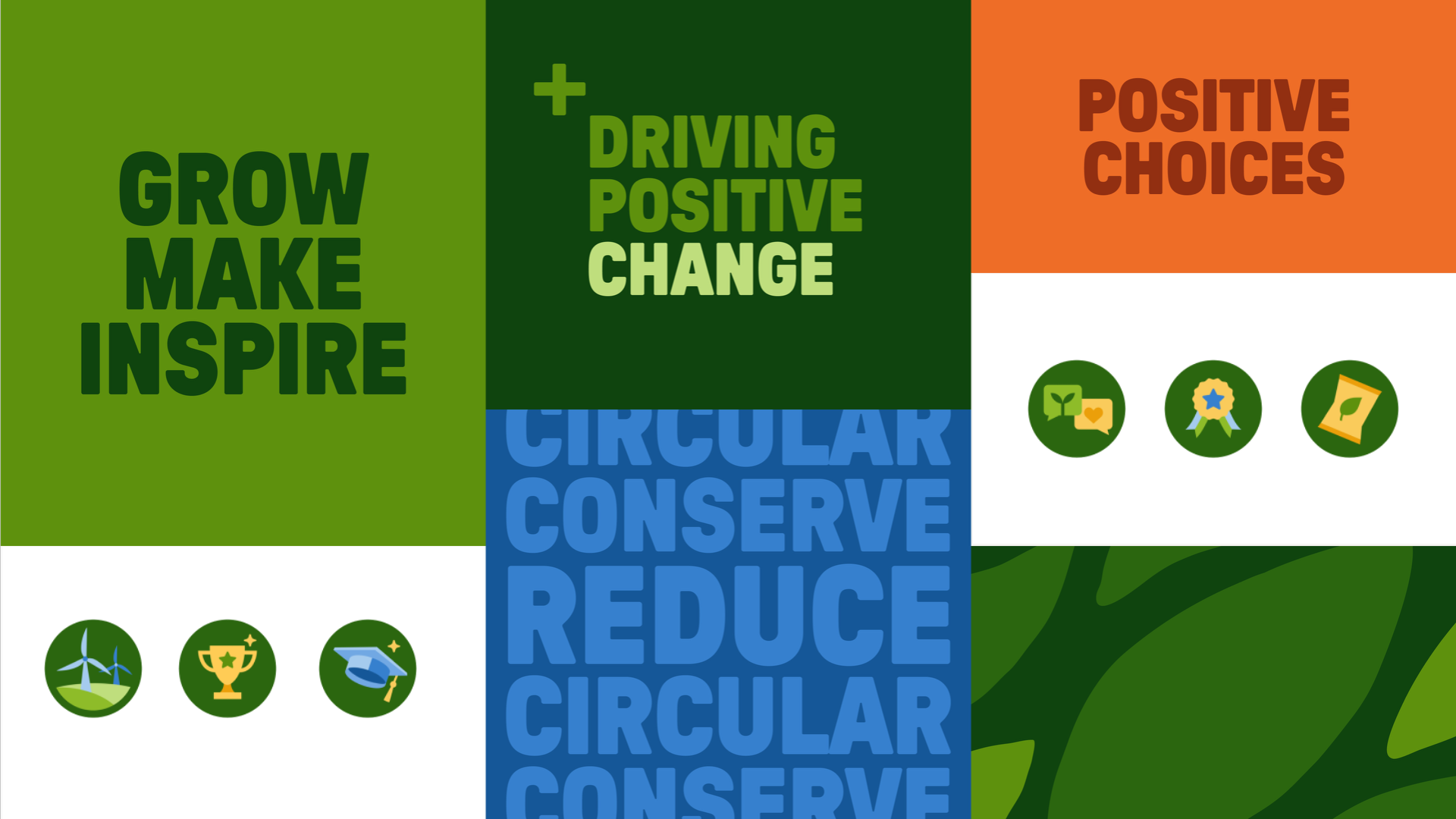
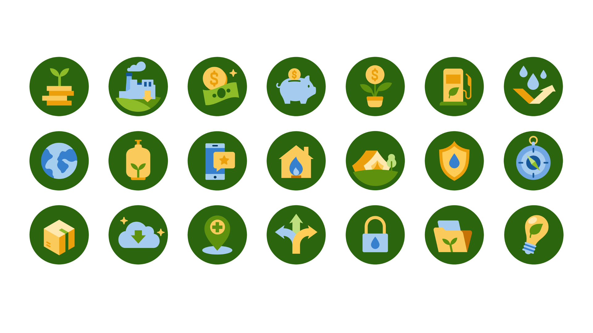
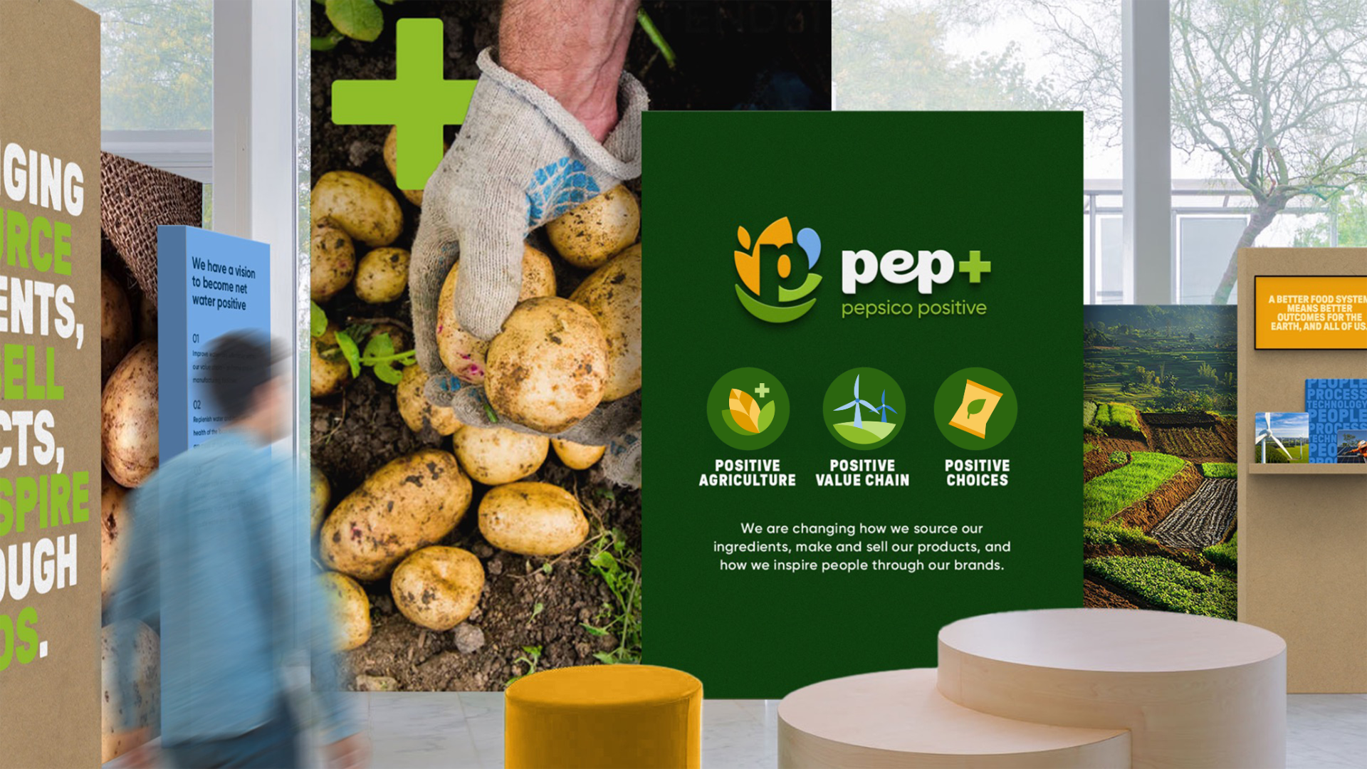
Style 3 / Multi-Color (Program Specific)
•Evolves and refreshes the Pep+ brand visual language
•Universal multi-color icons that can be consistently used across multiple areas
•More illustrative, can get complex ideas across
•Functional separation between icons

Style Summary: <Elaborate>